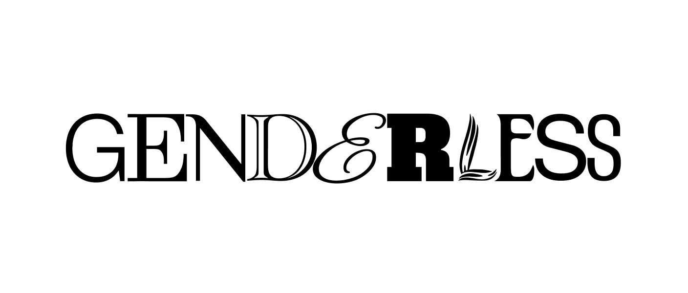
Genderless design is a myth
How to deconstruct the gender binary in design and make space for genderfluidity.
Written by
August Tang
Cover Image by
Manoel do Amaral
How to deconstruct the gender binary in design and make space for genderfluidity.
Design can never truly be free of culture, gender, and bias. Our pursuit of a neutral and universal design may bring us to modernism, minimalism, and the Apple-esque aesthetic, but these design schools, inspired by eurocentric standards, carry qualities associated with masculinity. How can we go beyond the stereotypical binary view of masculine and feminine and create more universal, inclusive designs? Genderfluidity can give us a hint about the future of design and culture.
Beyond universal design
Universal design was a concept that originated in the context of architecture, asserting the importance of accessible environments for everyone, regardless of ability, age, or status. Within graphic design, universal design has become synonymous with The International Typographic Style—or Swiss Design—due to its emphasis on objective clarity and supposed neutrality. The impact of Helvetica in our culture is well documented in films and can be noted in our everyday life and is one the best examples of the values of the Swiss Design school.
Photo by Mick Haupt on Unsplash
However, in today’s world where we’re building products for multifaceted audiences, universal design and Swiss Design cannot always be a reliable answer. And although the founders might like to believe so, Swiss Design is not free of meaning and bias.
Historically, systems were put in place to serve the privileged (ie white / men / cisgender / heterosexual / wealthy / able-bodied / etc). As time progressed, design has shifted towards the idea that everyone deserves access and that we no longer want to design for solely the privileged class, we want to design for everyone. However, the sentiment of designing for everyone still falls short when serving unique, multifaceted individuals.
Instead of designing for the universal, we need to embrace a mindset that no group of people is a monolith.
Even communities that we group together have nuances within them. Thus, we have to move from the idea of a universal design to the idea of designing for a pluriverse. Designing with a pluriversal mindset (versus a universal mindset) means that as designers, we become intimately familiar with the users we’re serving. With sensitivity to race, culture, class, sexuality, gender, ability, and more, we can make design solutions that celebrate and acknowledge user differences, rather than erase them with a single solution that will inevitability carry the bias and values of the status quo.
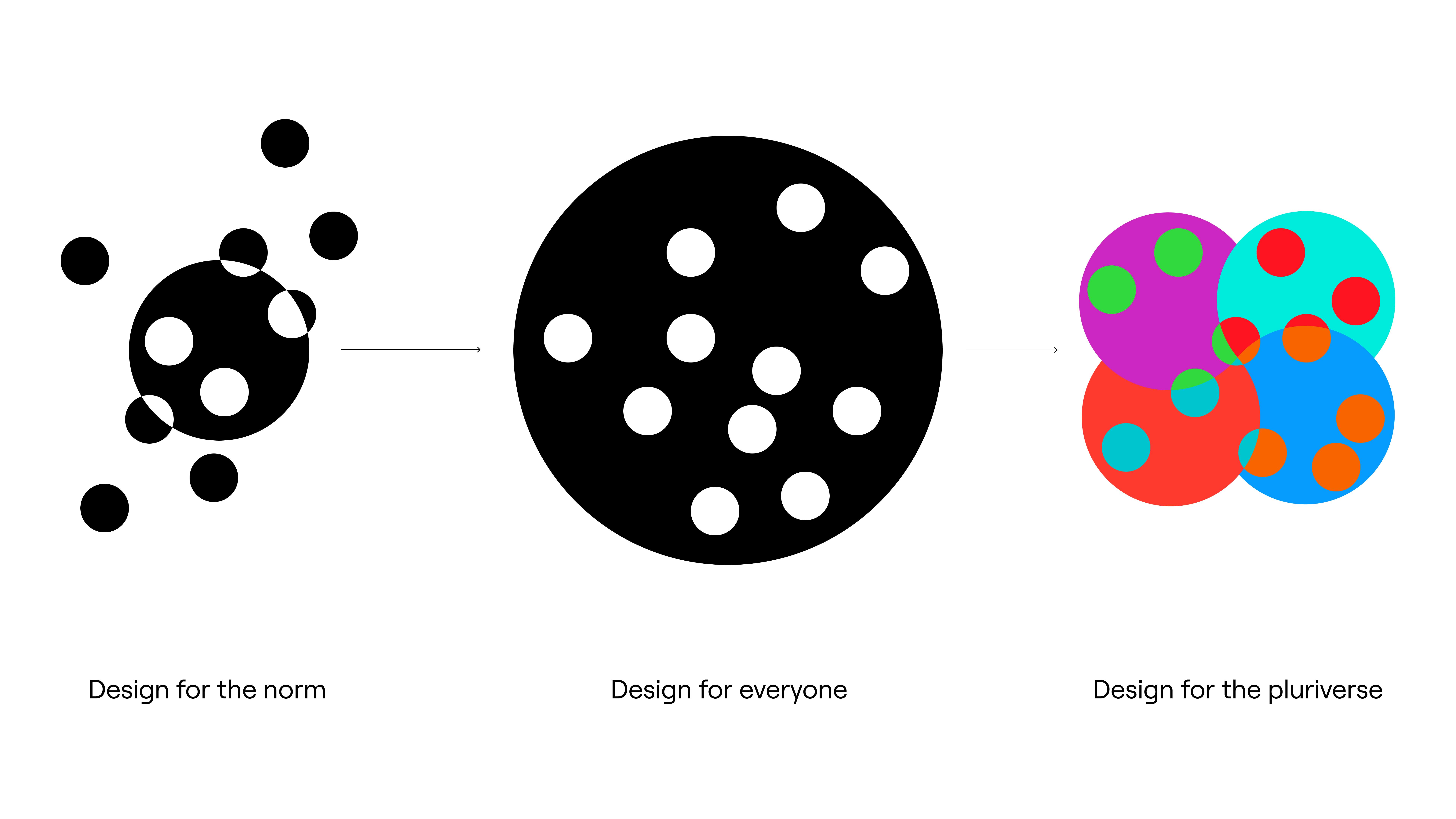
Designing for the pluriverse diagram, based on a reference by Mauricio Mejía
Genderless design is a myth
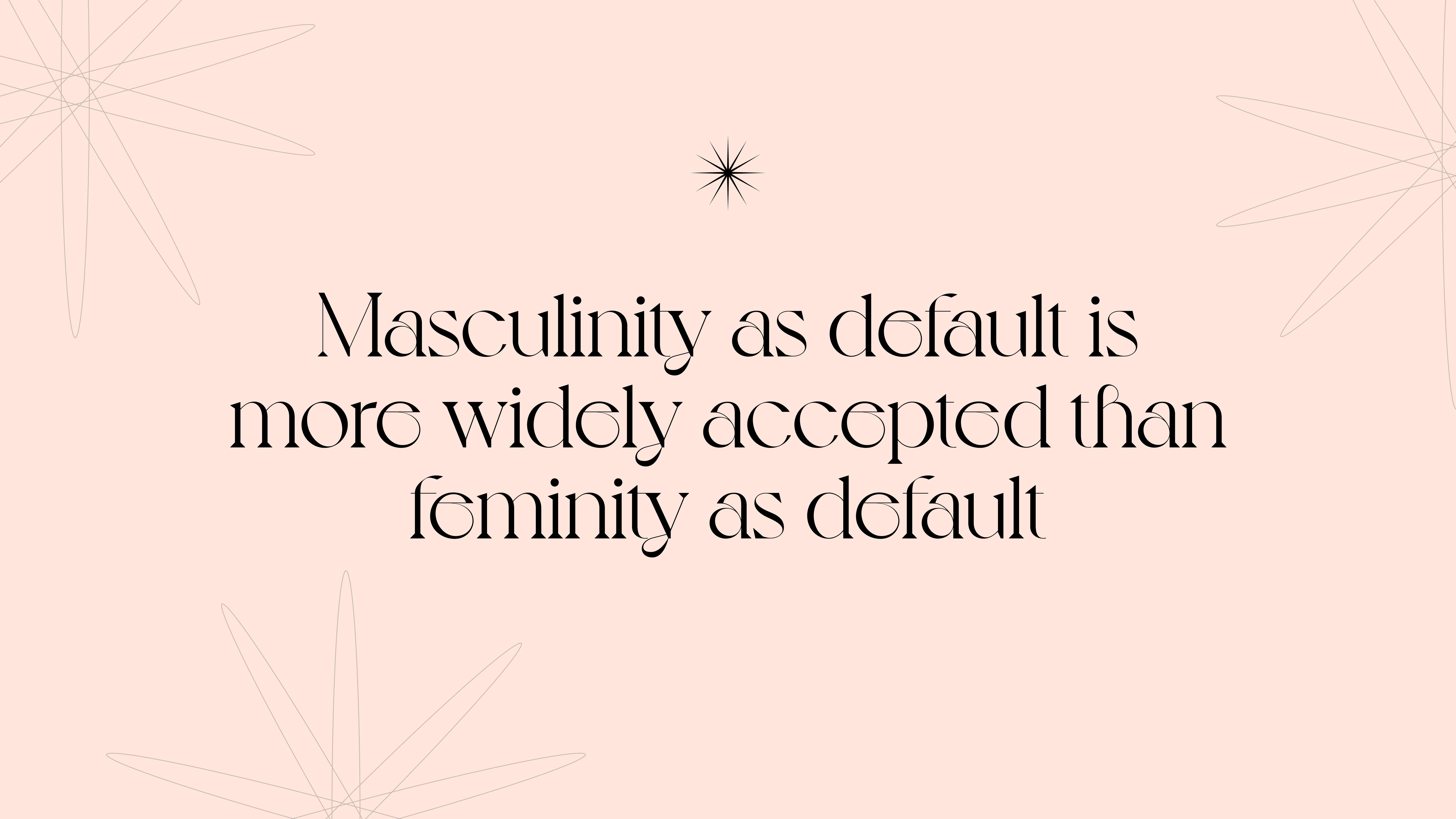
The concept of genderless, universal design is an illusion. The reality of Swiss design is that it perpetuates the idea that masculinity is the norm; masculinity equates to neutrality.
A parallel example can be seen in the fashion industry. Androgyny in the context of clothing often is synonymous with menswear. Upon googling “gender-neutral fashion,” most of what surfaces are t-shirts, formless sweaters, button-ups, and hoodies. I and Me, a denim and lifestyle brand from London, UK is a prime example, claiming on their website, “The design process is gender-neutral, it will always be about fabric and style before ‘his and/or hers’; this is where the story begins with every garment — on a neutral playing field undefined by seasonal trends.”
I and Me’s Better With U Collection
As much as well-intentioned designers might aim to neutralize gender in their work, attempts to degender a product or space often mean defaulting to a plain style leaning towards masculinity. Even if the original designer claims neutral intention or say that gender doesn't play a role in their work, it’s inevitable and unavoidable that cultural norms will still impose meaning and gender onto objects. It only means then that they are accepting and replicating the status quo. Instead of falling back on norms and universal rules, designing for the pluriverse gives us the opportunity to move beyond the gender binary into a more sophisticated space.
How gender presentation shows up in design
Eurocentric standards and norms have historically perpetuated the gender binary. Framing women as the opposite of men allowed patriarchy to thrive and defined the dichotomies that define gender stereotypes today. In a patriarchal society, masculinity is synonymous with power, superiority, dominance, and control. Therefore, by opposition, femininity represents weakness, inferiority, submission, and servitude.
Art direction example for masculinity.
Art direction example for femininity
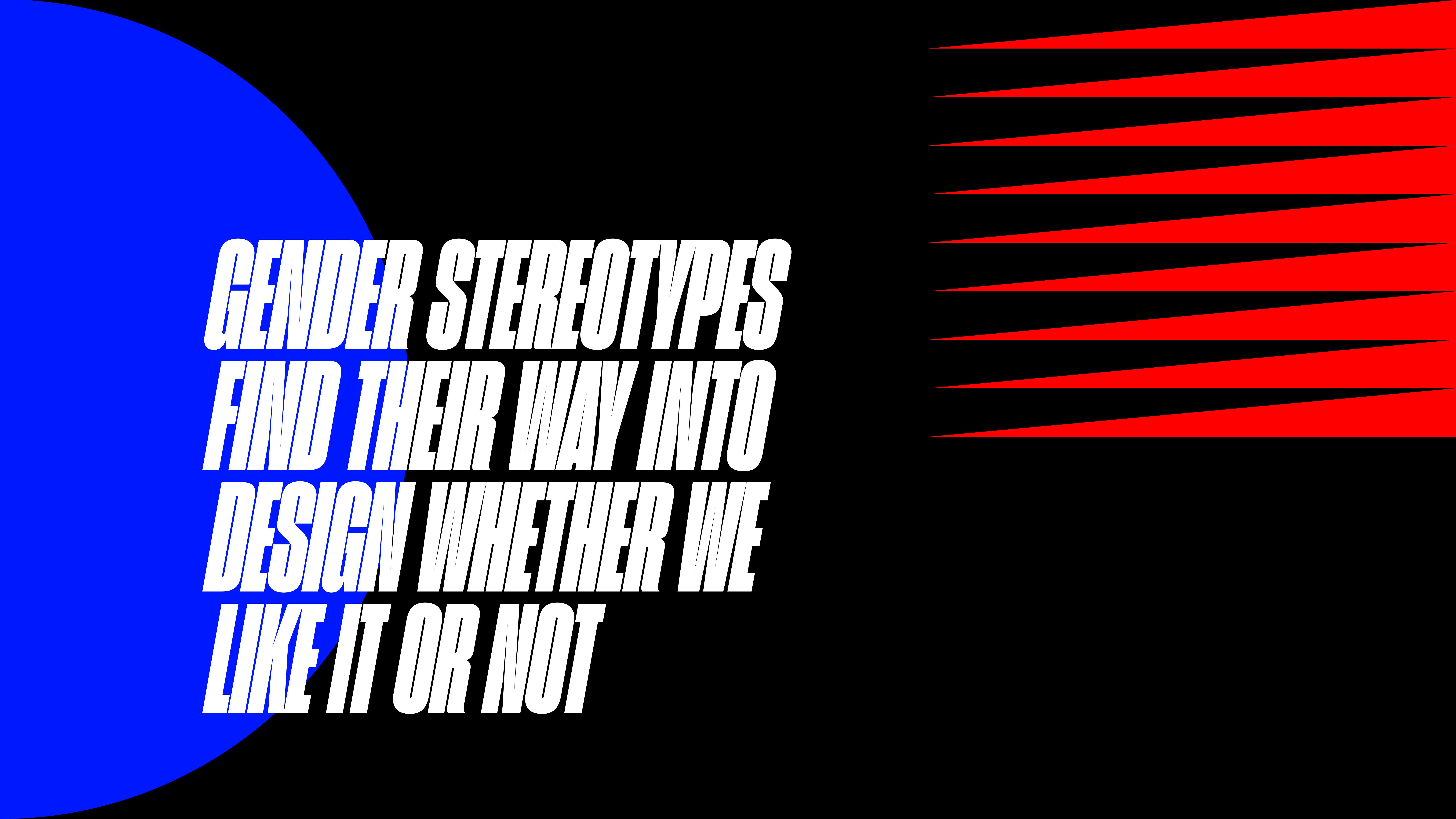
Gender stereotypes represent themselves in design predictably. Art directions that are bold, blocky, emotionally restrained, and conservative in color are associated with masculinity. Within the construct of the gender binary, femininity in design is the opposite. Expressive typography, delicate forms, and toned color schemes are typically perceived as feminine. The gender binary is harmful in many ways. Not only does it perpetuate a power structure between masculinity and femininity, it also erases the reality that many cultures, including indigenous, have been celebrating and accepting of nonbinary genders for centuries.
The gender binary is a relatively recent and Eurocentric perspective that oversimplifies reality.
The future of design is inherently genderfluid. Acknowledging the masculine or feminine roots of a design, instead of erasing or ignoring them, unlocks the potential for multifaceted, nonbinary solutions. We cannot make designs that are devoid of gender. As designers and creatives, what we can do instead of attempting to detach gender from design is engage in what I like to call “gender fuckery.”
How to deconstruct the gender binary in design
Design that acknowledges a genderfluid reality has more potential to be rich with culture, meaning, and purpose. Gender fuckery is the practice of subverting traditional binary gender norms through mixing, blending, and bending gender expressions. By adopting this approach and applying it to a design practice, we not only create more multifaceted solutions, we begin deconstructing the gender binary through our work.
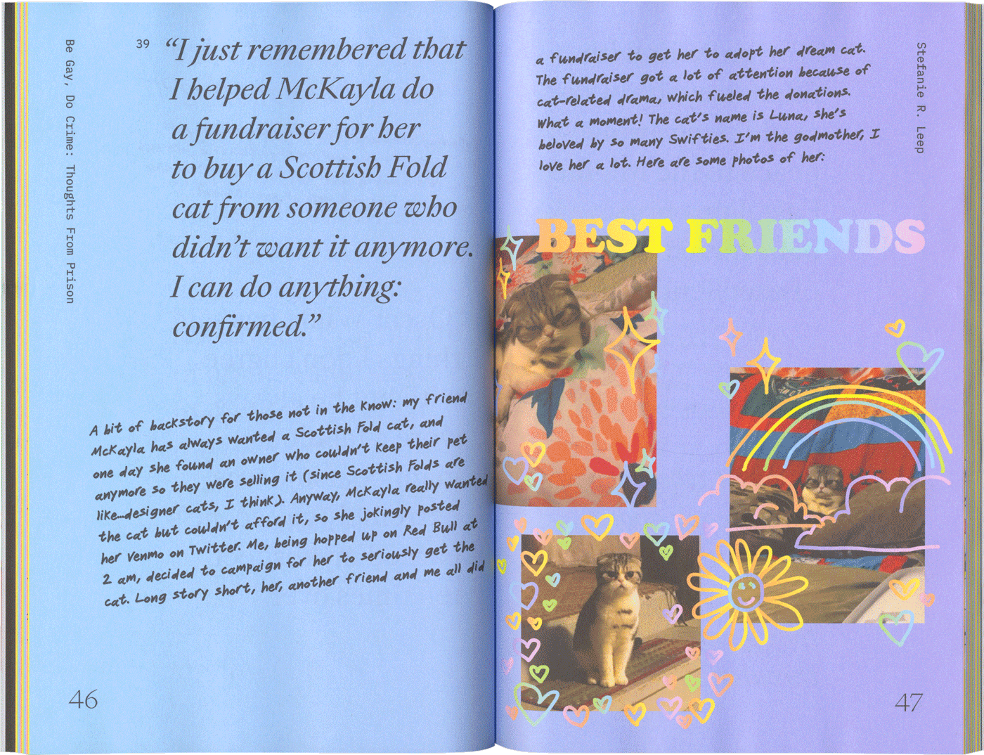
Sample spread from the book design for Be Gay Do Crime
The image samples of Be Gay Do Crime are an editorial example of how we can begin to introduce genderfluidity into design work. Due to the inherently queer nature of the project, I was highly experimental with the combinations of imagery, illustration, typography, and layout. In combining an expressive serif, a monospaced type, and a handwritten font, the typography itself is an uncommon showcase. The type styles, paired with soft, colorful gradient backgrounds, photo collages, and rainbow trackpad illustrations make the book a prime instance of gender fuckery.
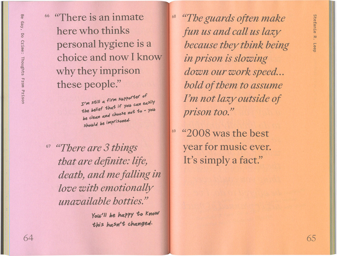
Another sample spread from the book design for Be Gay Do Crime
The concept of mixing, blending, and bending gender in design can be pushed to a further extreme than this one example I provided. However, in a corporate setting and non-queer spaces, the application of genderfluidity may face more resistance. I have worked with brands in the past where clients were hesitant to change, in fear of alienating their dominant user group. For example, a stereotypically masculine product, such as a grill, might be marketed with a bold, sporty typeface. We could expect this brand to showcase lots of meat / men in the outdoors / colors like charcoal and orange. However, a few ways to subvert the look and feel of the brand could be to introduce a serif typeface, lighter tones of colors, and rounded edges. When working with an existing brand that is highly polarized and gendered, there are still subtle ways to tweak and evolve. For reference, here are a few starter areas for intentionality when it comes to design choices:
Typography: where does type family come from? What does it convey? What font pairing can balance it out?
Colors: what is the meaning behind these colors? What's the story behind this color palette or trend?
Photography: how can we go beyond the typical stock photo?
Illustration style and graphic elements: what does it convey? How is it associated with stereotypical views of masculine and feminine?
The future of design business is genderfluid
The gender binary perpetuates harmful and inaccurate stereotypes, as well as upholds power structures. Instead of attempting to erase this reality, we can evolve beyond the gender binary to reach new audiences. Being intentional about how to use and break from the sterotypical views of femininity and masculinity is key to arriving at a gender-inclusive solution. Embracing gender fuckery in our practice and moving past a rigid, normative approach is a form of resistance against the patriarchy, challenges stereotypes, and allows design to resonate with more people. Genderfluid design avoids alienating the non-dominant gender and instead appeals to a broader spectrum of users and untapped markets – there is a great business case for brands wanting to keep relevant, expand their markets and differentiate from the monotonic mainstream discourse. Design as a profession serves a business. But it can also intentionally subvert the norms to open new opportunities - for people and businesses. Gender fuckery is always relevant.
The future of design is genderfluid.
My perspective on this topic is ever-evolving. Feedback, comments, thoughts, and callouts are welcome.
Works cited
- Swiss style by PrintMag
- Helvetica movie review by New York Times
- LinkedIn post by Mauricio Mejía
- Be Gay, Do Crime by August Tang