The aesthetics of our new fictions
Written by
Caio Braga,
Fabricio Teixeira,
Luciano Infanti
Art direction by
Manoel do Amaral
“Everyone, deep in their hearts, is waiting for the end of the world to come.”
― Haruki Murakami, 1Q84
150.
“Even today, a critical threshold in human organisations fall somewhere around this magic number. Below this threshold, communities, business, social networks and military units can maintain themselves based mainly on intimate acquaintance and rumour-mongering. There is no need for formal ranks, titles and law books to keep order. A platoon of thirty soldiers or even a company of a hundred soldiers can function well on the basis of intimate relations, with a minimum of formal discipline. (...) But once the threshold of 150 individuals is crossed, things can no longer work that way. (...)
How did Homo Sapiens manage to cross this critical threshold, eventually founding cities comprising tens of thousands of inhabitants and empires ruling hundreds of millions? The secret was probably the appearance of fiction. Large numbers of strangers can cooperate successfully by believing in common myths.” (Yuval Harari)
We live in a world of fictions
Imagine trying to cross a busy Manhattan street without the existence of traffic lights. Or trying to pay for your groceries by singing an acapella rendition of Imagine, by John Lennon, instead of using cash or a credit card. The world around us is filled with invisible social contracts that we all accept and subscribe to without thinking.
From the moment we as humans started to organize ourselves into larger groups, following social contracts to ensure a certain level of the order became crucial.
“People easily acknowledge that ‘primitive tribes’ cement their social order by believing in ghosts and spirits and gathering each full moon to dance together around the campfire. What we fail to appreciate is that our modern institutions function on exactly the same basis.” (Yuval Harari)
What we are calling “fictions” here are social contracts—money, ethics, laws, countries, religions, flags, totems, fashion, music, arts— rules we create to be able to agree on social norms and expectations. Some may be nearly universally accepted, while others may vary by region or socioeconomic context. Most of us accept, believe, or at least abide by multiple social contracts at any given time. Because they are so powerful and omnipresent, we often don’t acknowledge that they are not laws of nature, but fictional constructs.
“The ultimate, hidden truth of the world is that it is something that we make, and could just as easily make differently.” — David Graeber
These fictions take different forms throughout centuries and locations. Fashion is a good example: what’s elegant in one time and place may be edgy or unacceptable in another. Modern concepts of countries and nationalities are also fictions, suggesting that all people within imaginary territory lines should share the same values, rituals, mores, and beliefs.
Stewart Brand named these different types of fictions and their relationships with each other "pace layering." He identified fashion, commerce, infrastructure, governance, culture, and nature as distinct layers that move at different paces but affect and inform one another. What’s cool on TikTok might be different week over week, but changes to hegemonic structures of government and dominant culture might take years to happen.
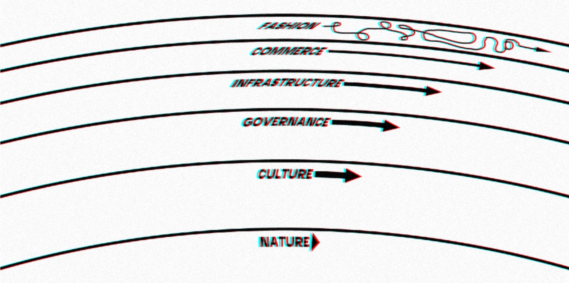
Stewart Brand coined the term "paced layers" to illustrate how different parts of society move at different speeds.
Social fictions can also expand beyond their original context: A cornerstone of globalization, for example, is the imposition of fictions from a few powerful people and countries to the diverse majority—controlling the fictions to control the narrative. When the United States imposes a global definition of Free World, or when an American cultural export like Friends becomes one of the most popular TV shows in the world, the United States is influencing different layers of other societies.
The result is the oppressive replacement of a wide spectrum of cultures and ways of life with a single set of fictions—a monoculture in which cultural layers are uniform and connected, and in which the demise of certain fictions can have seismic consequences across the globe.
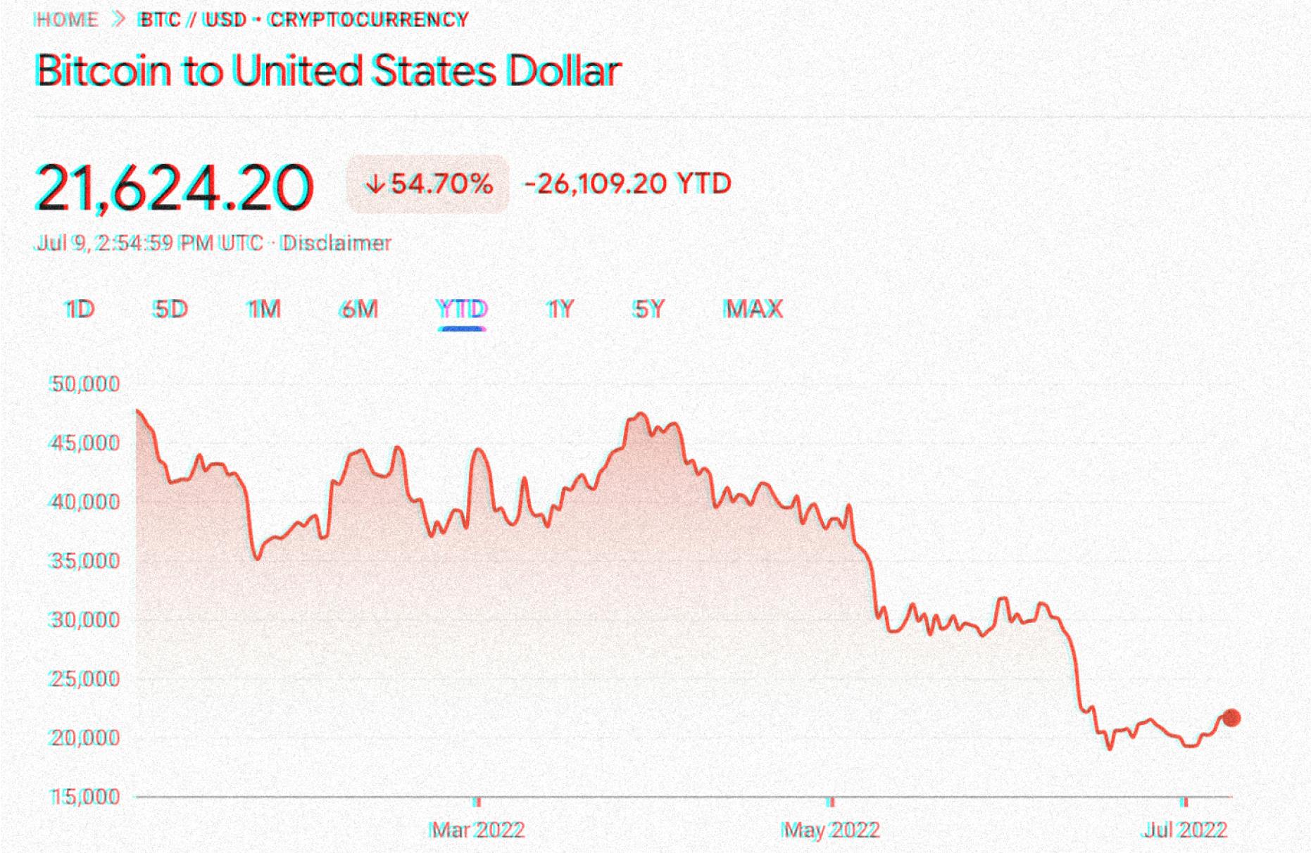
Bitcoin, one of the emerging (and dying?) fictions that disguises a (fictional) attempt at global standardization as beneficial financial decentralization.
Power both creates and depends upon the shared fictions of the monoculture. Power self-perpetuates through control of these fictions, which must be coded as legitimate and immediately recognizable through their symbolism, language, and design.
The role of aesthetics in building fictions
Symbolism and other aesthetic indicators help make social fictions feel legitimate, trustworthy, and familiar. These visual codes instill trust and aid recognition when a fiction expands to different contexts, places, or eras.
Let’s look at money (in paper form) as an example.
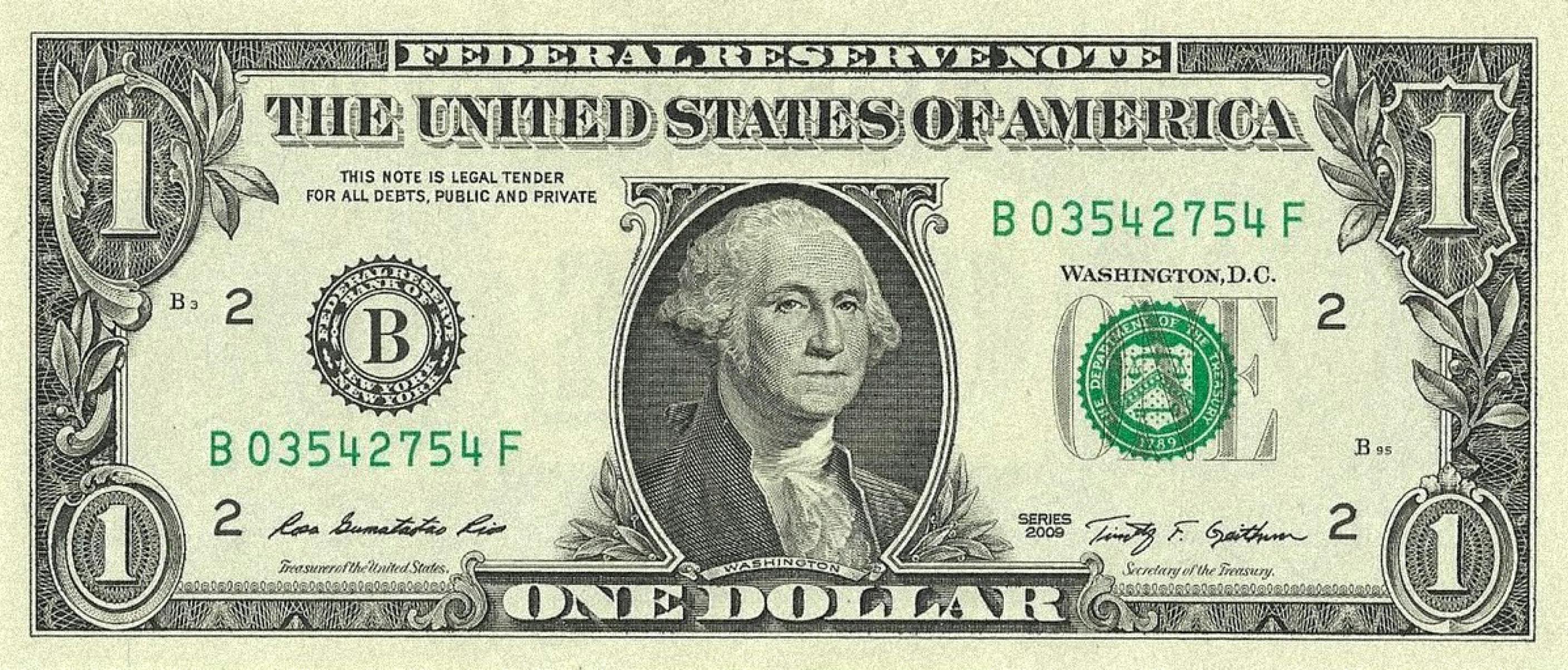
Obverse of the United States one dollar bill
When you look at a U.S. one-dollar bill, you know exactly what it is and where it is accepted, and you have a rough idea of its value.
The one dollar bill has the oldest design of all U.S. currency currently being produced. The obverse design of today’s dollar debuted in 1963 when it was first issued as a Federal Reserve Note. The reverse design debuted in 1935. Around 12.7 billion dollar bills are in circulation worldwide.
The design of the dollar bill is full of meaning. Each symbol builds on older symbols and social fictions. By design, many of the symbols on the dollar bill are familiar to the people who use it, who are bound by the social contract of U.S. currency.
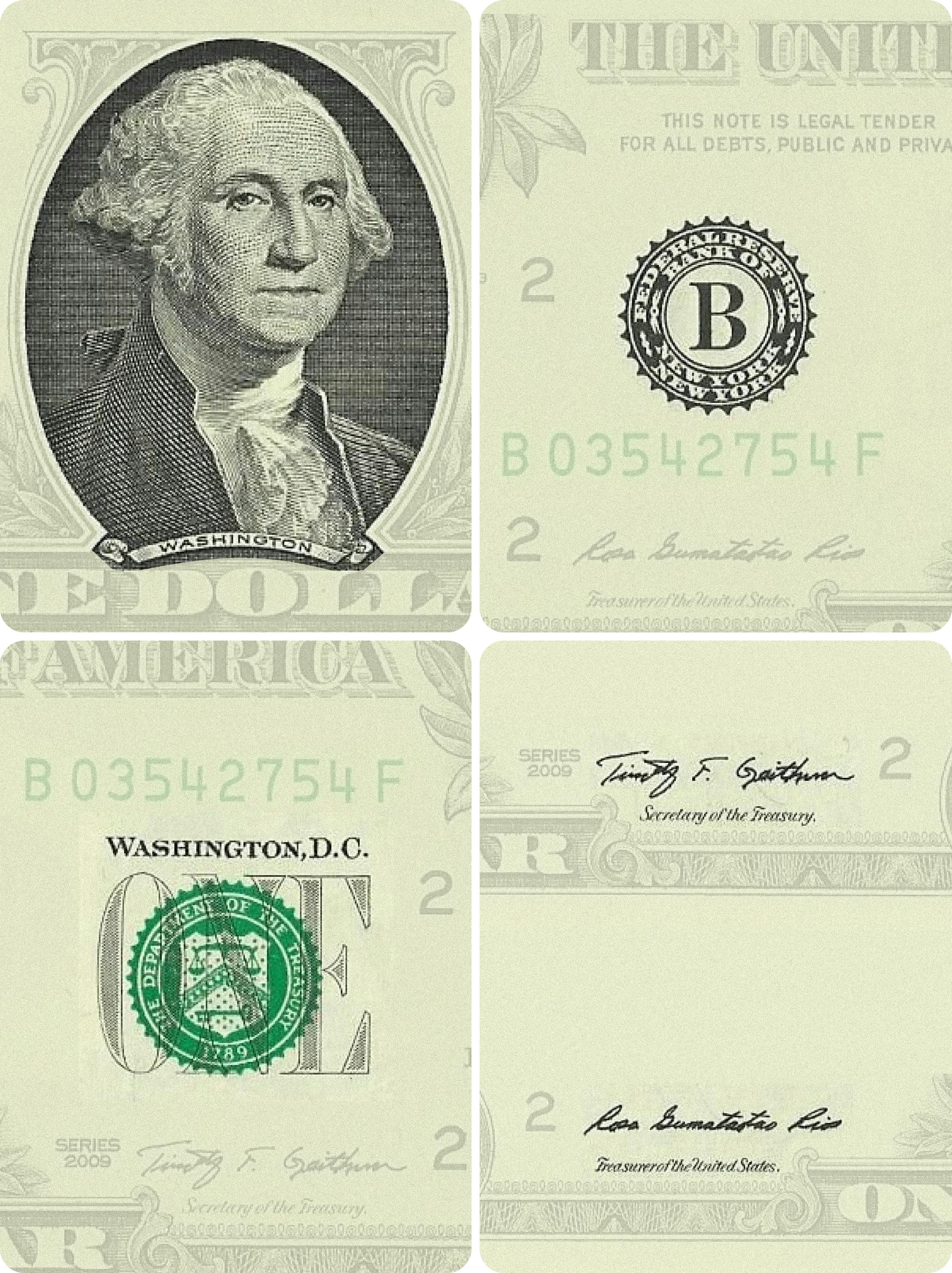
[1] An image of George Washington, the first U.S. President, based on the Athenaeum Portrait by Gilbert Stuart (1796).
[2] The Federal Reserve District seal. The name of the Federal Reserve Bank that issued the note encircles a capital letter (A–L), identifying it among the twelve Federal Reserve Banks. The sequential number of the bank (1: A, 2: B, etc.) is also displayed in the four corners of the open space on the bill.
[3] The Treasury Department seal. The scales represent justice. The chevron with thirteen stars represents the original thirteen colonies. The key below the chevron represents authority and trust; 1789 is the year the Department of the Treasury was established.
[4] The signatures of the Treasurer of the United States (left), and the Secretary of the Treasury (right), along with the series date.
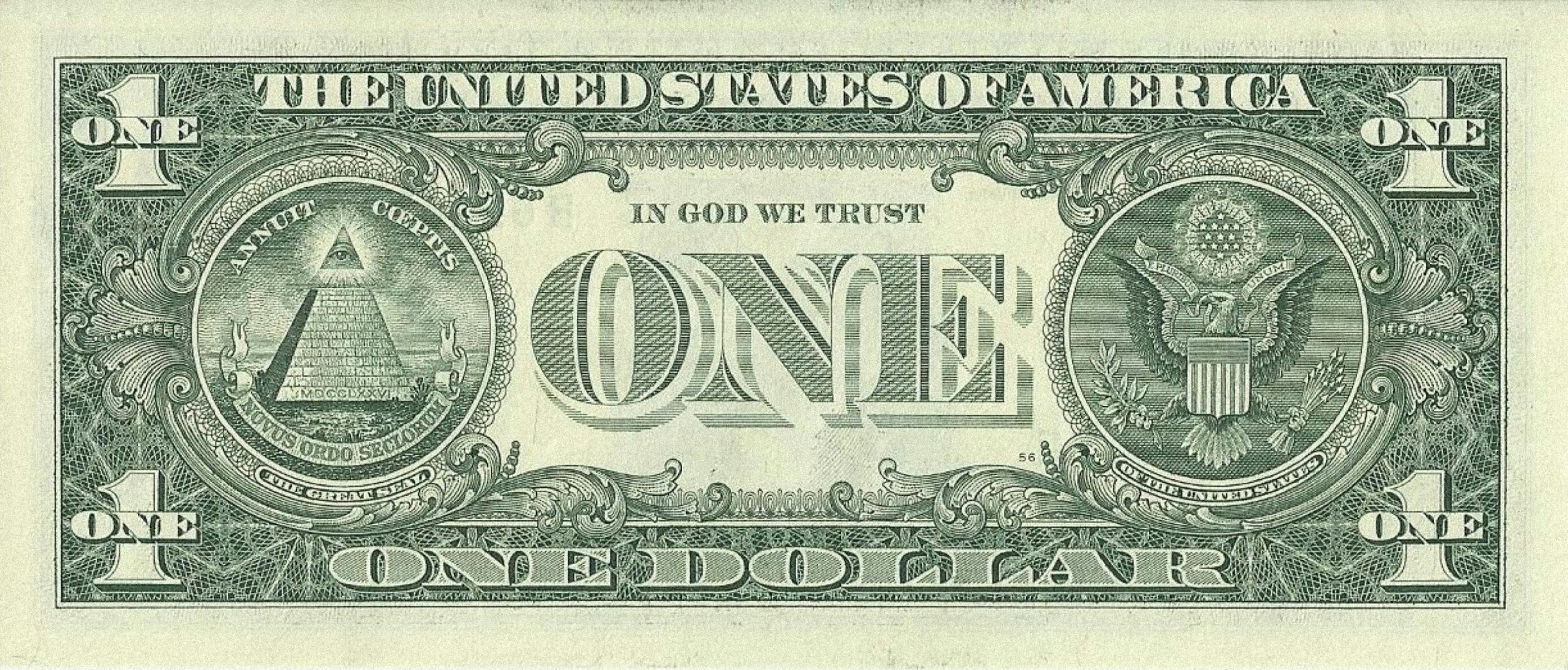
Reverse of the United States dollar bill.
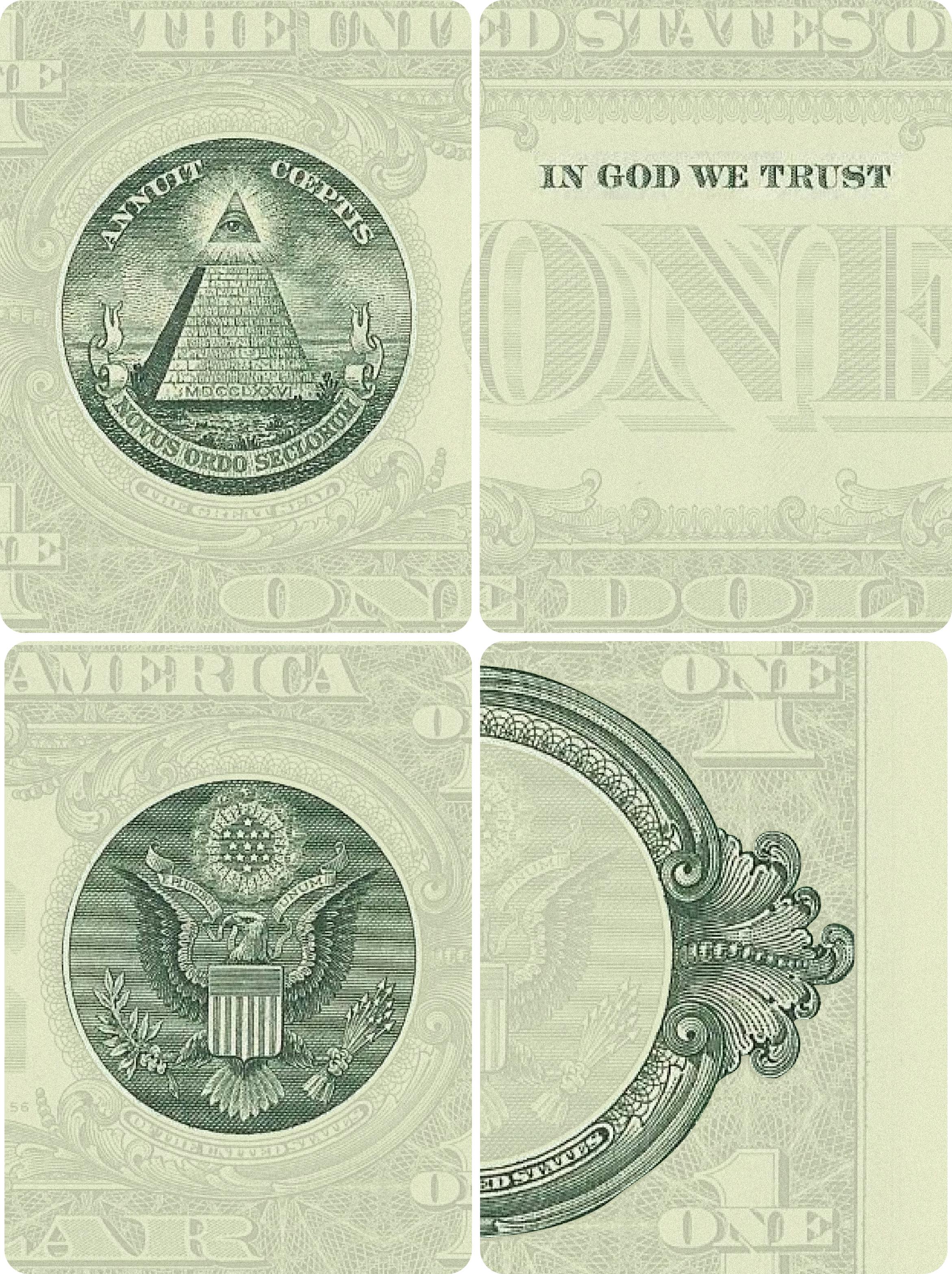
[1] A barren landscape dominated by an unfinished pyramid of 13 steps, topped by the Eye of Providence within a triangle. At the base of the pyramid are engraved the Roman numerals MDCCLXXVI (1776), the date of American independence from Britain. At the top of the pyramid stands a Latin phrase, "ANNUIT COEPTIS," meaning "He favors our undertaking." At the bottom of the seal is a semicircular banner proclaiming "NOVUS ORDO SECLORUM" meaning "New Order of the Ages" that is a reference to the new American era. To the left of this seal, a string of 13 pearls extends toward the edge of the bill.
[2] The inclusion of the motto, "In God We Trust," on all currency was required by law in 1955, and first appeared on paper money in 1957.
[3] The American eagle flying free, holding 13 arrows of war in its non-dominant left talon and an olive branch for peace in its dominant right talon. The banner in the eagle’s beak reads "E Pluribus Unum," meaning “Out of Many, One.” The shield's horizontal blue band represents Congress uniting the original 13 colonies, represented by 13 red and white vertical stripes.
[4] The Great Seal, originally designed in 1782 and added to the dollar bill's design in 1935, is surrounded by an elaborate floral design. The renderings used were the typical official government versions used since the 1880s.
“Financial documents are designed to look trustworthy by using a style of writing or typography that is consistent, legible, and official. Documents are provided with a seal protecting the message contents, but also carry the symbol—and thus the authority—of the sovereign. State seals, national coats of arms, or bank logos still have a similar function. Finally, the date and the signature make these documents legally binding.” (Ruben Pater)
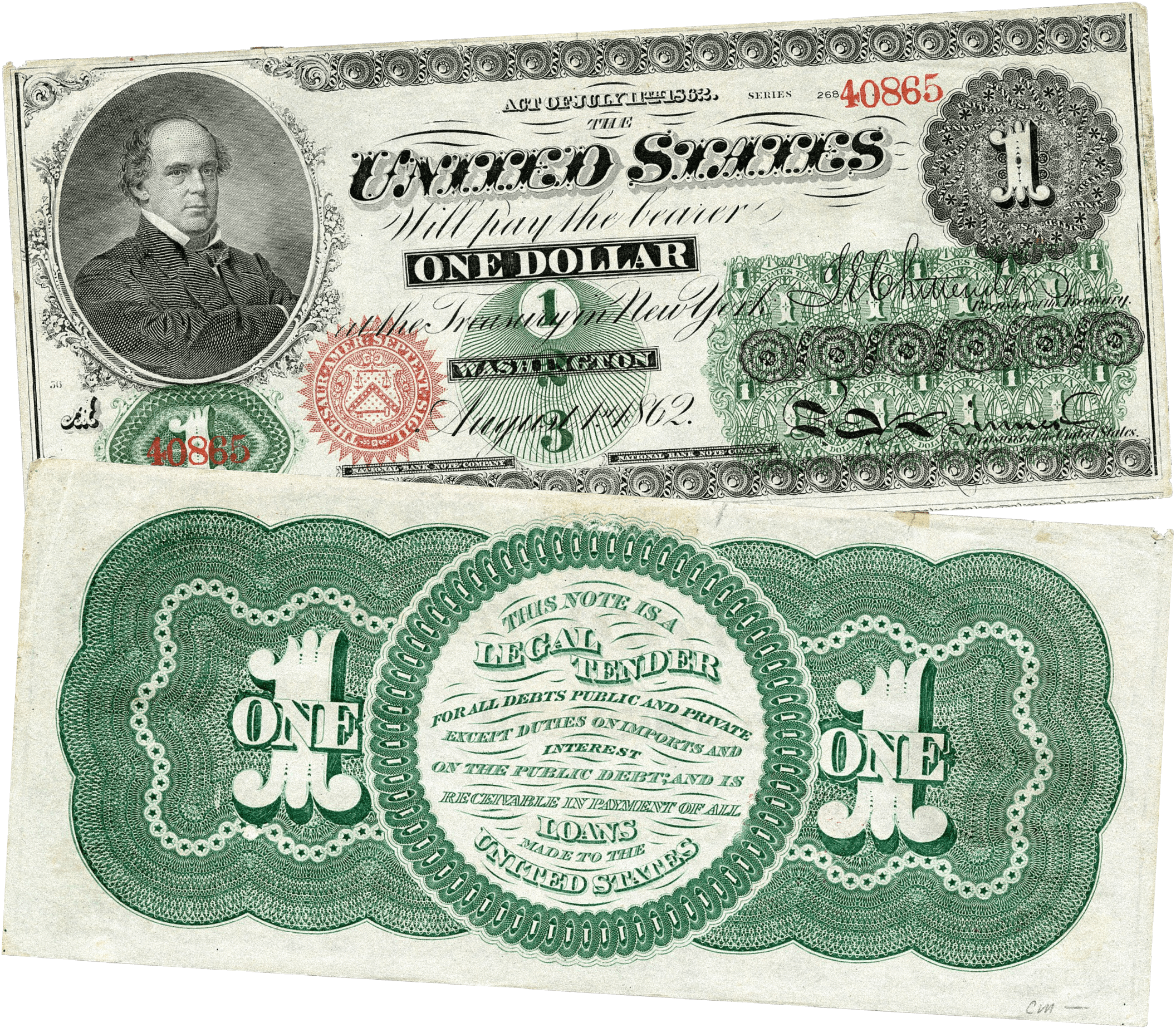
The dollar bill design has evolved over time. Each iteration represents a move towards a more credible, trustworthy, and believable version of the same fiction: from the choice of typography, to decorative elements that surround key focal points, to the color green—which since the 1860s was added to the dollar bills as an anti-counterfeiting measure to prevent knockoffs and is now a color associated with money in many countries, including the ones that do not use the United States dollar as their main currency.
The new bills circulated by the U.S. government starting in the 1860s became known as “greenbacks” because their backsides were printed in green ink. This was an anti-counterfeiting measure designed to prevent photographic knockoffs, since the cameras of the time could only take pictures in black and white. (History.com)
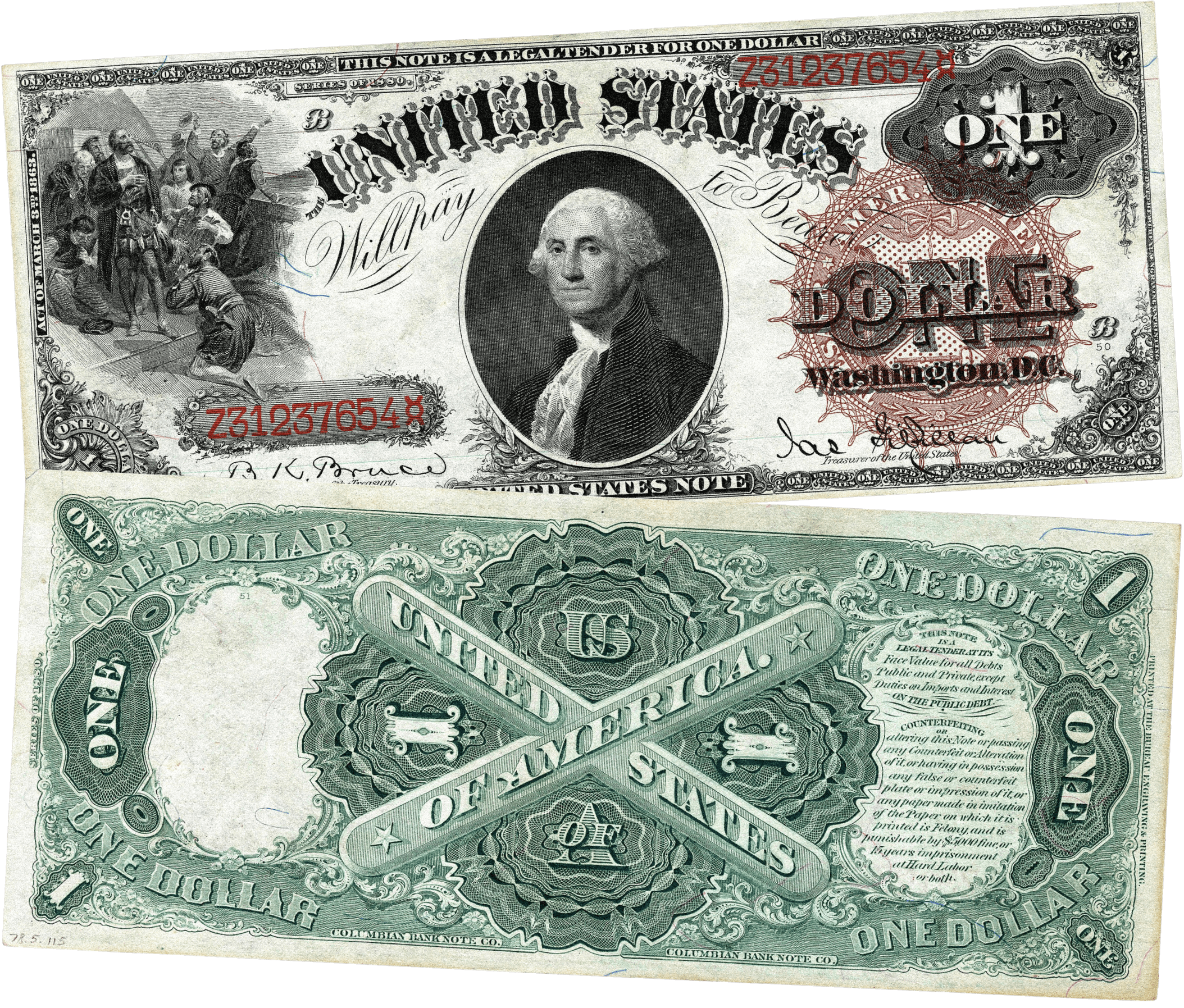
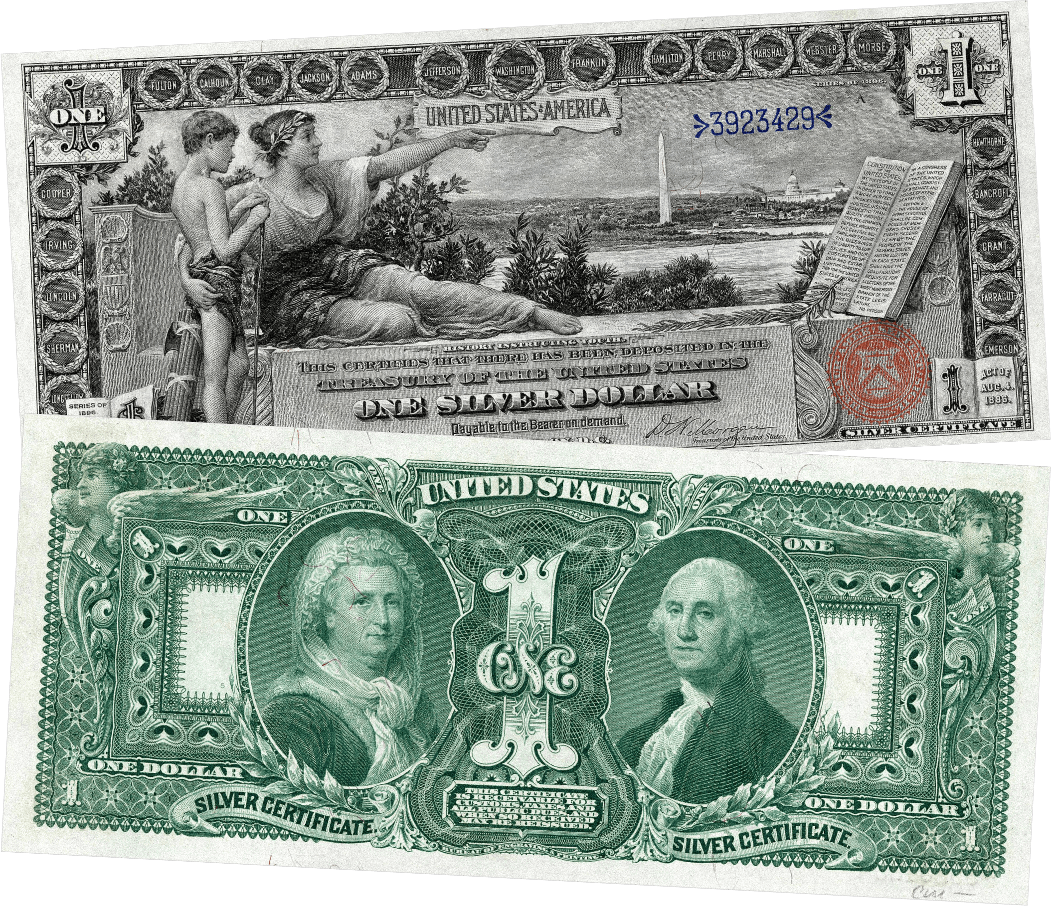
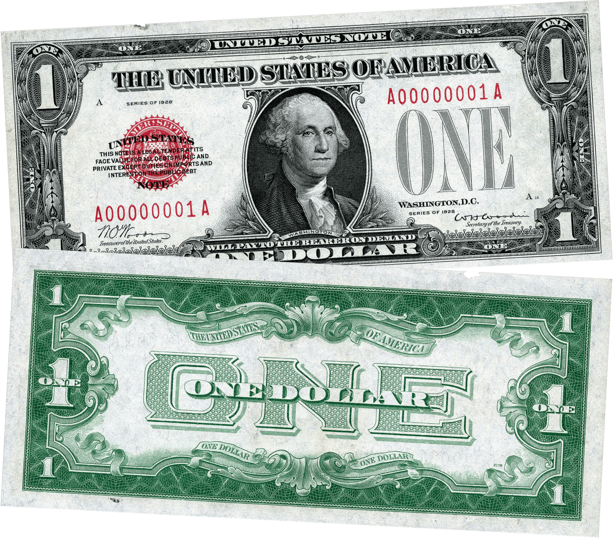
The symbols of power and authority we see on the modern dollar might not have appeared on the first dollar bill, but many of its visual elements draw on centuries of design evolution. Coins, seals, certificates, and other official documents from various regimes and cultures have contributed to a collective visual lexicon of symbols that convey legitimacy and trustworthiness.
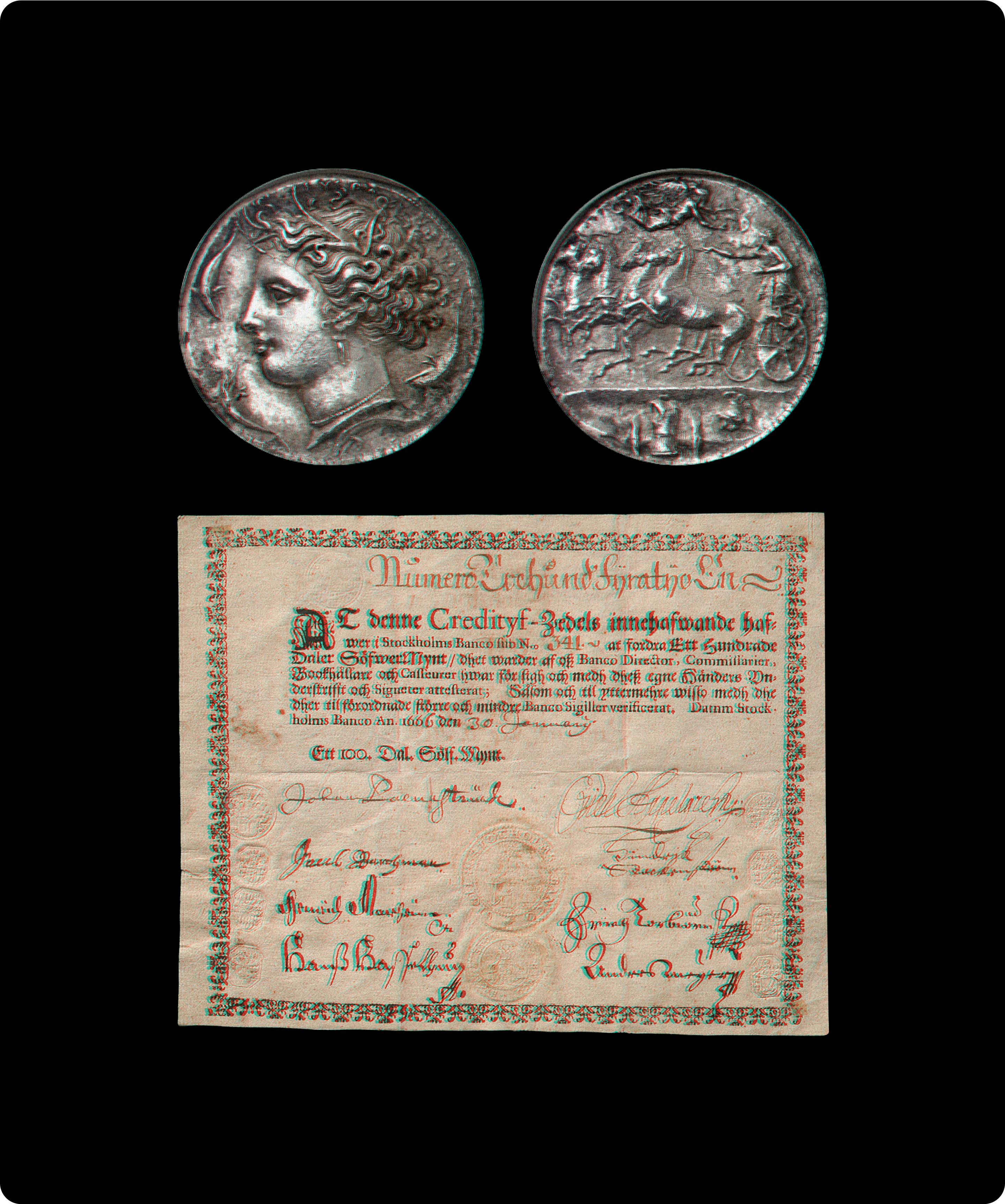
Greek coins from Syracuse, 415-405BC. First European banknote, the Swedish daler banknote, 1666. (CAPS LOCK)
The same visual lexicon shows up in designs created well after the dollar bill, like bank checks or credit cards: their design elements are often a mix of historical references and a reflection of the time they were invented. Over time, the aesthetic of the fiction evolves. It takes a new format with a slightly different meaning.
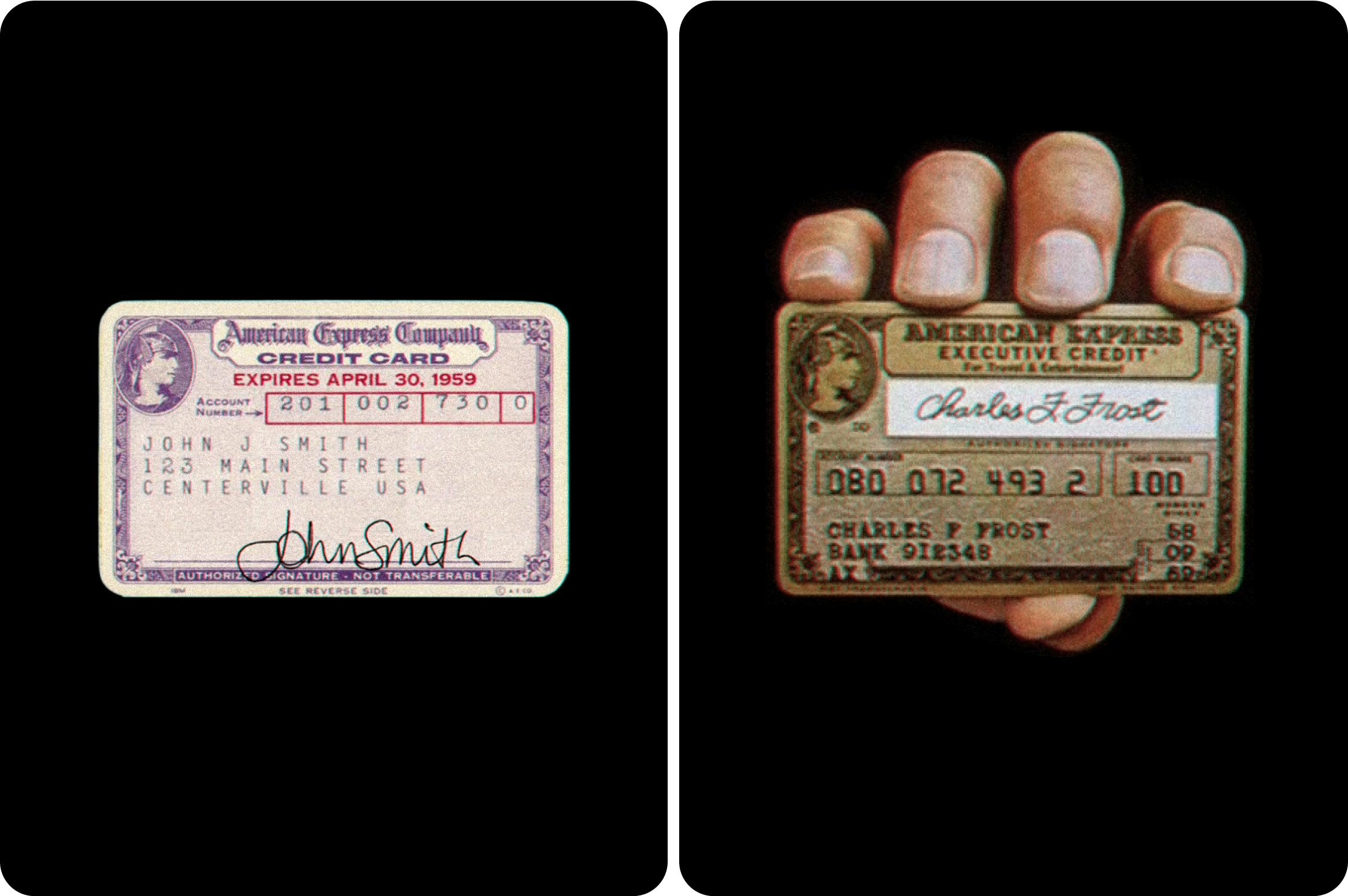
First version of the American Express card, 1958. Print ad for American Express Gold, 1968. (American Express)
To this day, when someone wants to reference the dollar bill in a design, it’s noticeable how certain visual cues remain—even when the medium and the level of fidelity are completely different. Leveraging mental models from previously established fictions helps create a feeling of familiarity, which in turn helps people believe in the new, emerging fiction.
CAPS LOCK, by Ruben Pater, cites a plethora of visual examples to demonstrate the inextricable link between graphic design and capitalism, and the designer’s role in shaping them both

PicPay Mobile App
The aesthetics of our many fictions continue to evolve, every single day and at every step the world takes towards believing them more—or believing them less.
The aesthetics of our many fictions continues to evolve.
Aesthetics are representative of their era, beliefs, and culture
Money is just one example of a social fiction we interact with every day, but fictions are ingrained in multiple aspects of society.
Think about the concept of Artificial Intelligence (AI), and all the visual metaphors that have been used over the decades to explain to people what it is and how it works. AI began as an academic discipline in 1956, but it wasn’t until the 1980s that the term and the concept started making more public appearances in pop culture, movies, and TV shows.
At the time, such a novelty concept and technology had to be portrayed in a way that could both get people excited about an unknown future, as well as build on top of visual symbols and aesthetics that were known at the time. The novelty needed to look natural, human, and acceptable.
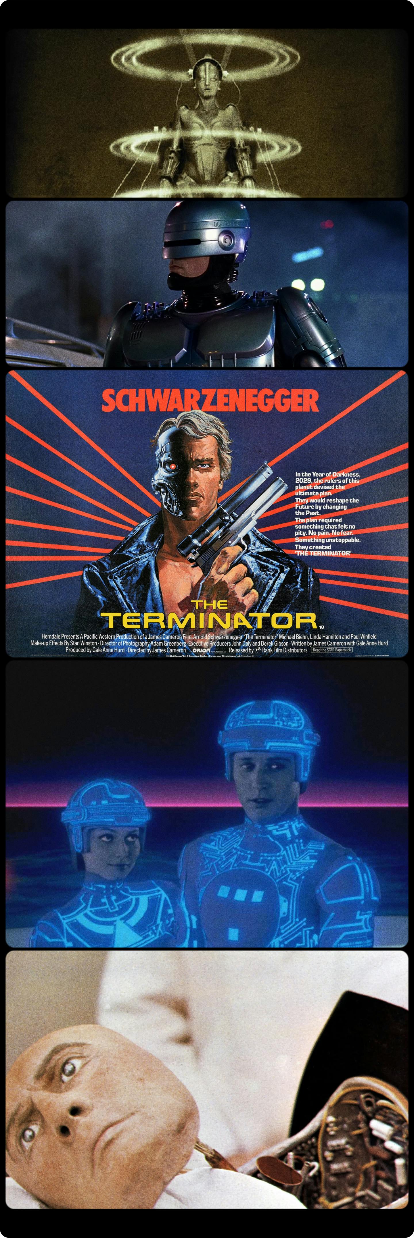
Metropolis (1927), Robocop (1987), The Terminator (1984), Tron (1982), West World (1973)
Fast forward to the 2020s and the way our society visually represents Artificial Intelligence has changed quite a lot. The concept itself isn’t as new to many people. Not because everyone has experienced or interacted with AI themselves in a memorable way, but because of how much the topic has come up in the news, movies, TV, and pop culture. Aesthetic choices now focus less on explaining AI and normalizing interacting with machines, and more on trying to make that technology look human, natural, or invisible.
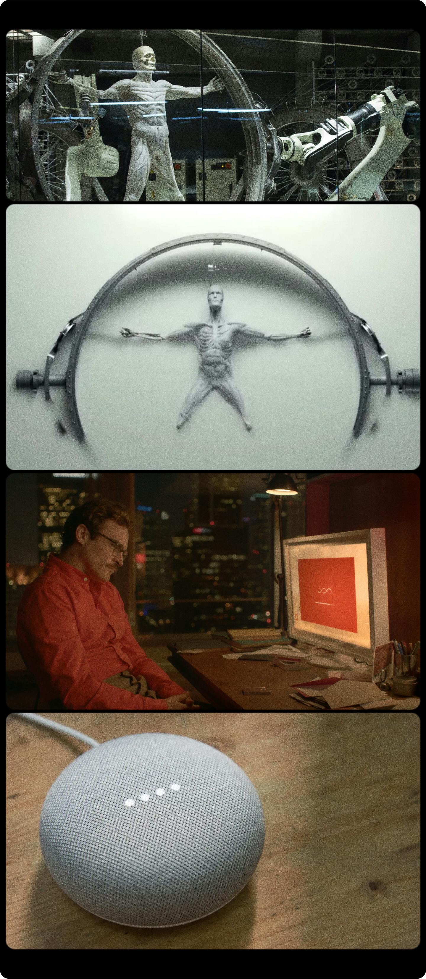
Westworld (2016), Her (2013), Google Home
Movies like Her normalized the acceptance of ubiquitous computing and created their own aesthetic based on a romanticized relationship between humans and machines, making space for the establishment of a service like Google Home, that taps into the same idea presented in the film.
Confusing symbols for confusing times
Every century sees its share of disruptions, but we are now experiencing major changes in several layers of society. Truth (as a universally accepted concept) is eroding, institutions that seemed steadfast are being questioned, and scientific credibility is at an all-time low. Anyone can now create new symbols that share the stage with century-old institutions.
Anything can look credible when you use the right aesthetic.
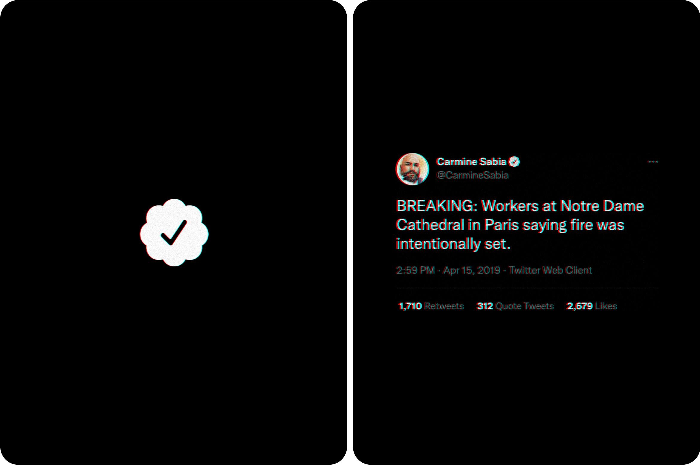
Is the Twitter Verified Badge an icon of trust? Many Twitter accounts that spread misinformation are verified, causing additional confusion on what is true—and who holds the truth.
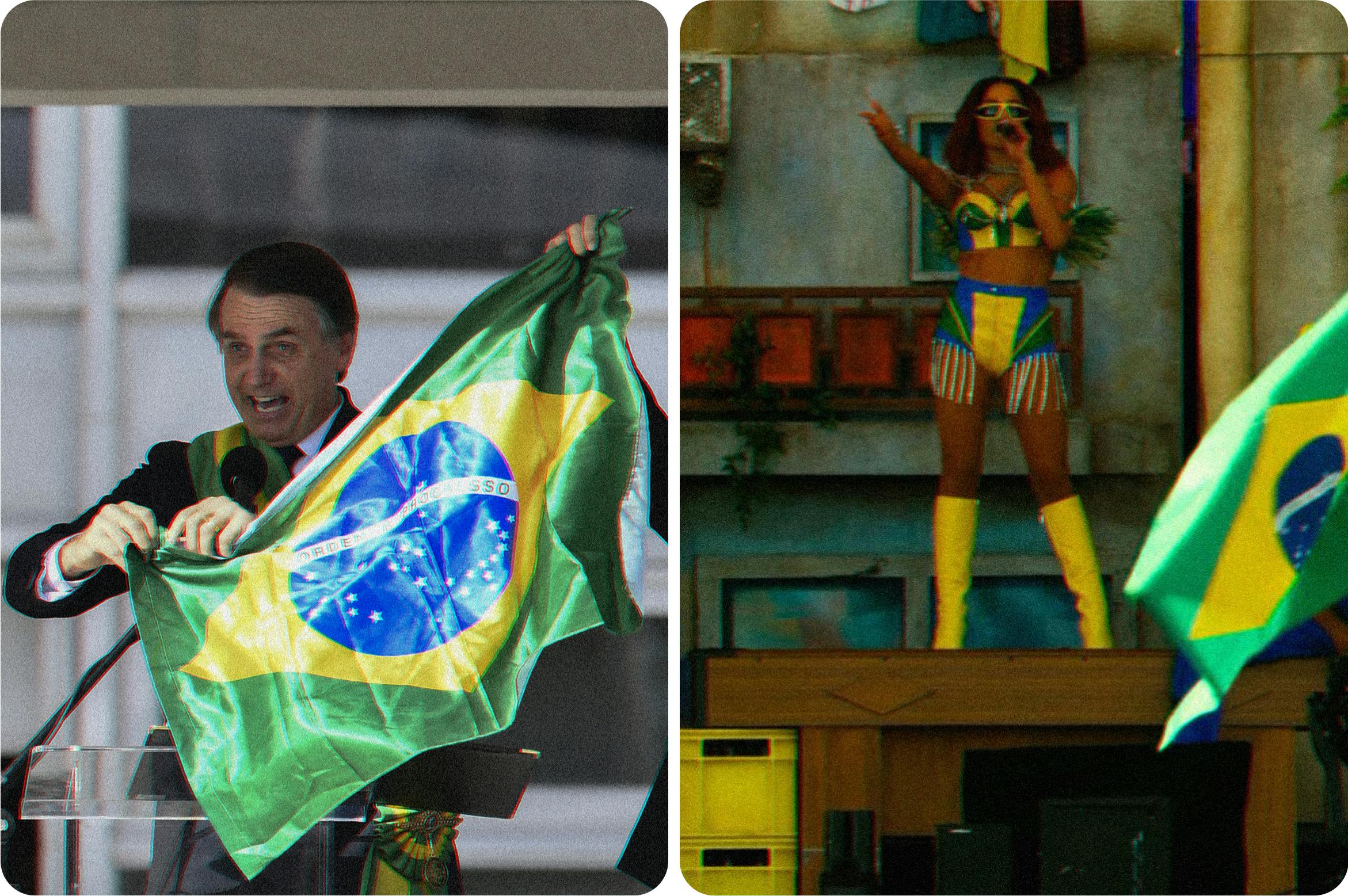
In recent years, national flags have been heavily associated with far-right movements and leaders around the world, including Brazilian president Jair Bolsonaro. In response, pop artists like Anitta are disputing again their national colors to re-appropriate and re-signify their meaning to the Brazilian people.
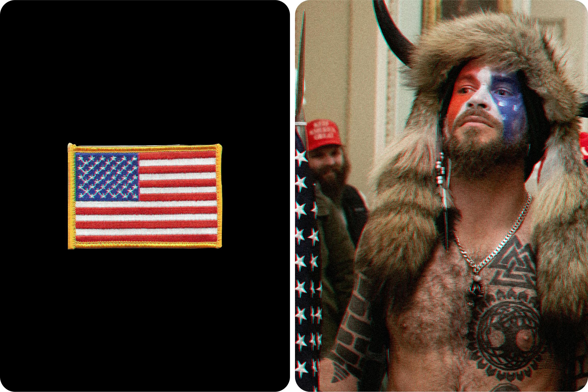
The juxtaposition of symbols shown here is representative of our times: the American flag mixed with nordic symbols, invading a building that is supposed to be the holding ground of democracy. The “Viking at the Capitol” image was imitated across social media, reinforcing this emerging, extremist worldview.
The process of questioning, antagonizing, and creating new fictions is natural, but the scale, speed, and intensity of social media radically changed how quickly this process takes place.
Any action or misstep can be easily tracked and exposed. The powerful fiction of infallible beings and institutions is easily questioned by any side. In turn, this fuels alternative “facts” and extremist agendas, supported by exaggerated and decontextualized information.
“When trust in government, media, and science declines, disinformation thrives because many people seek alternate facts. As a result, public resistance to rumor, conspiracy, hate, and lies weakens.” – Livingston, Bennett
As old fictions start losing their place, space opens for new fictions to emerge in parallel. New narratives, new truths, and new worlds are being created.
It might seem that we have no control over this chaotic, contradictory, and overwhelming process. But we must remember that within this transformational period, there is space for new, positive changes. As designers, we have a small but important part to play by shaping symbols and its structures.
Emerging aesthetics for emerging fictions
Visual symbols are powerful ways to communicate complex systems of meaning. Designers create them all the time—sometimes successfully, other times not as much.
Let’s look at some of the emerging products and services known as “web3.” The term is rising in popularity among technologists and investors, and it’s meant to represent the idea of a new iteration of the World Wide Web, incorporating concepts like blockchains, smart contracts, cryptocurrency, virtual reality, the metaverse, and NFTs. It's a new gold rush in a digital landscape.
All of this exciting new technology creates an atmosphere of positivity about the future for those who are invested in it. A similar feeling happened back in the '60s when President Kennedy made the famous speech "We choose to go to the Moon." Futurism references were at an all-time high. The Jetsons, the first color show broadcast on ABC, well captured that optimism. Cellphones, 3D printers, robots, natural voice interfaces, smartwatches, tablets, you name it. That optimism influenced the creation of a future that was assumed to be impossible. A similar positivity and enthusiasm are helping to create the fictions we see arising around web3 and blockchain technology.
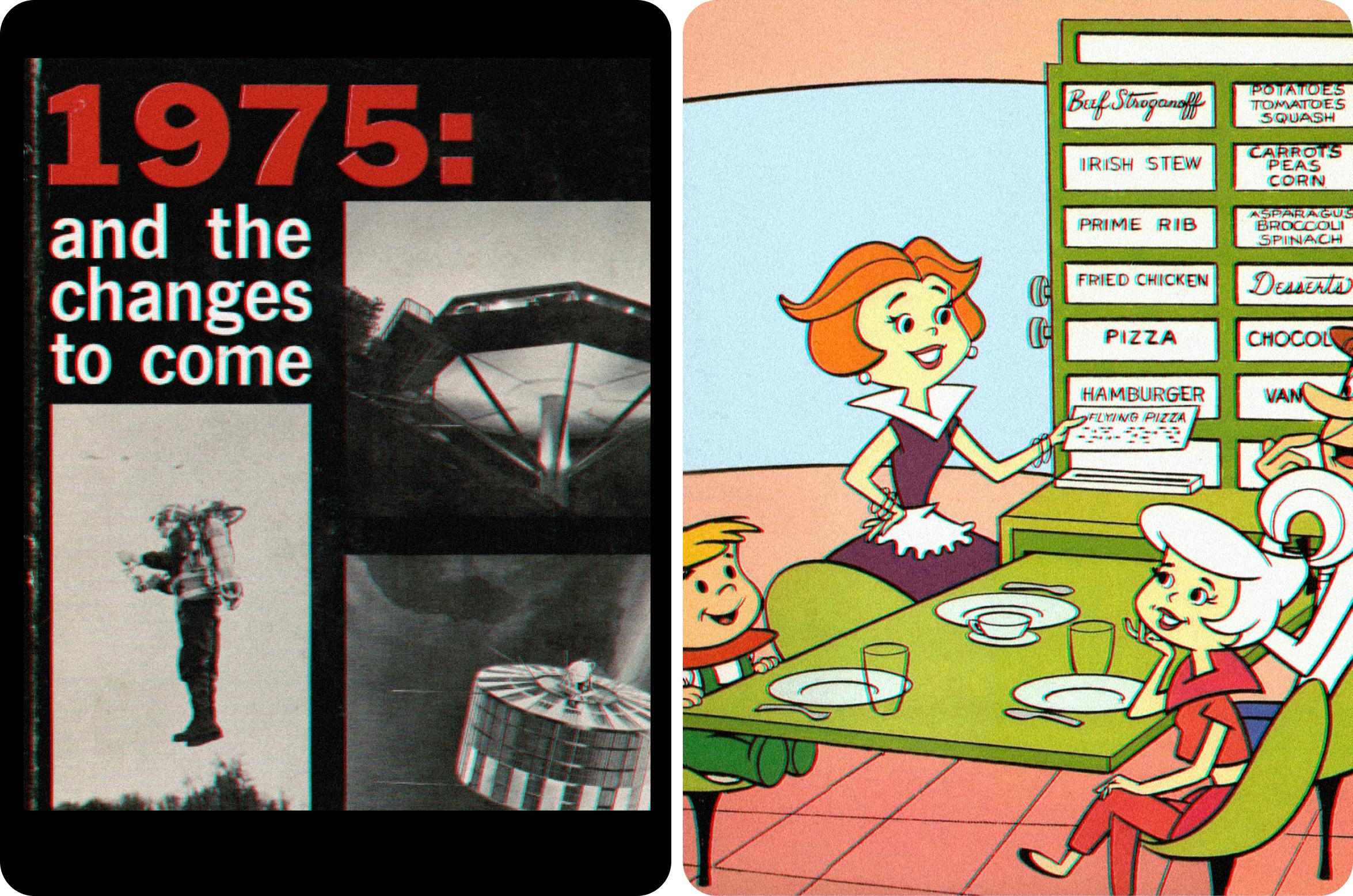
The Jetsons (TV Show) and its future-inspired theme predicted many technologies we now take for granted, like the smartwatch and cellphone, as well as others that have yet to be developed, like the food printer. The Jetsons was heavily inspired by the book 1975: And the Changes to Come by Arnold B. Barach, and heavily captured the optimism of its era.
What symbols does web3 currently rely on?
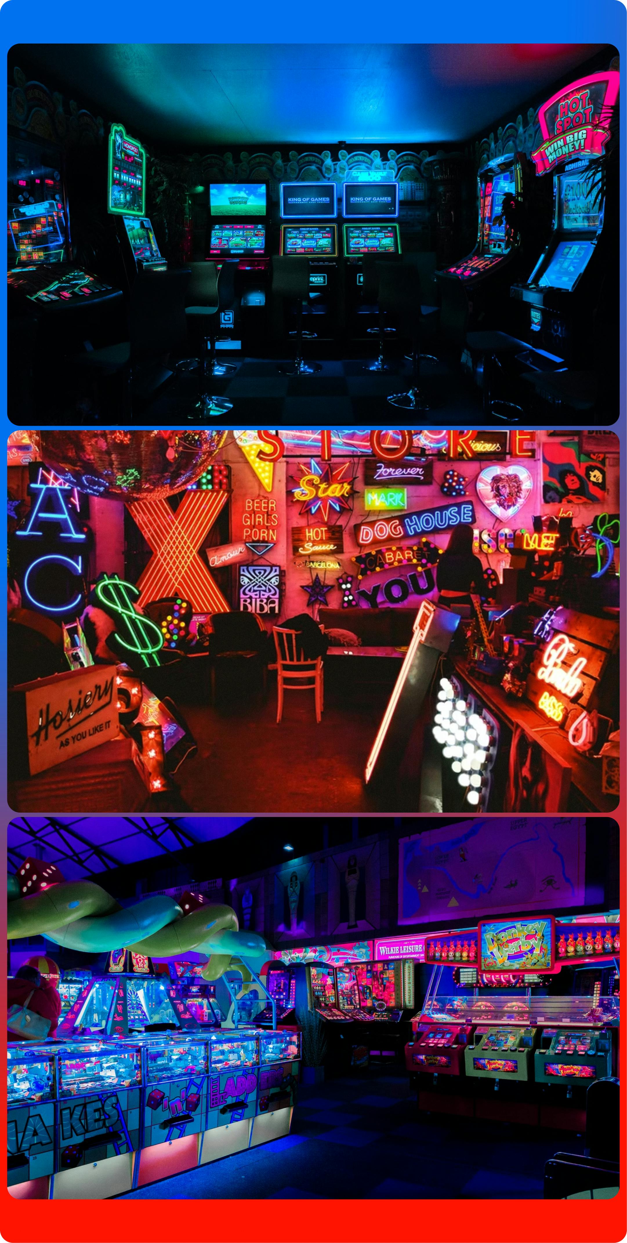
01. Gambling on game aesthetics
The aesthetics of many blockchain-based companies can be traced back to environments that once were the source of inspiration and fantasy: arcades. Low-resolution displays, oversaturated neon lights, and the vibrance of gaming are influencing a lot of the look & feel of these emerging services (as well as their business model) to attract new users.
02. Borrowing credibility from old money metaphors
Many of these new web3 services reference old metaphors to legitimate their currency system. In Economic theory, money has four main functions: to be a store of value, to be a unit of account, to be a medium of exchange, and to be a deferred payment. To convey all these functions, web3 services need to rely on the universal metaphor of the coin as a symbol of money. An interesting oxymoron if you think about it: they aim to build the future and disrupt the market but yet use established symbols as their foundation. A revolution that is unrecognizable is probably meaningless.
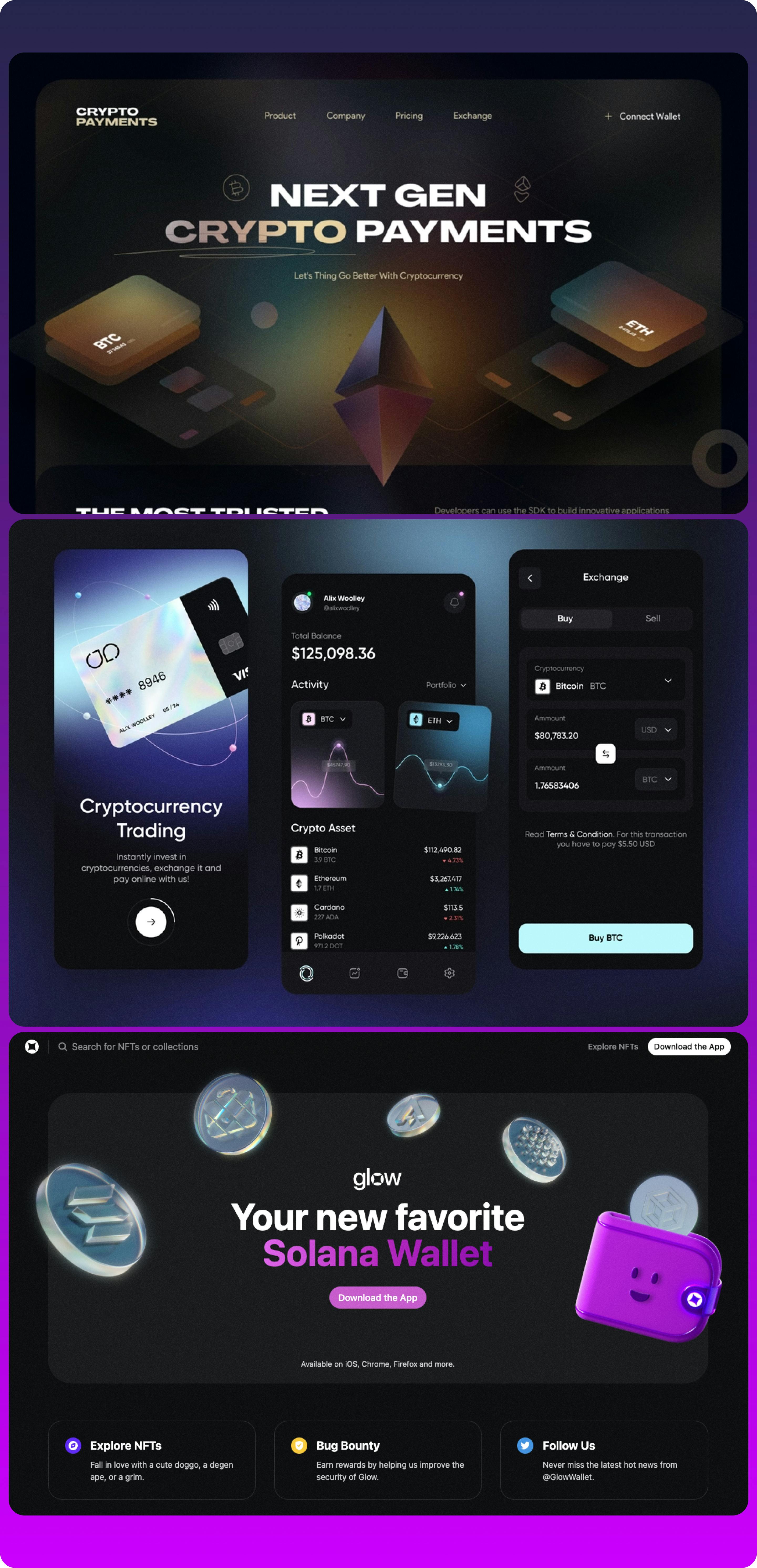
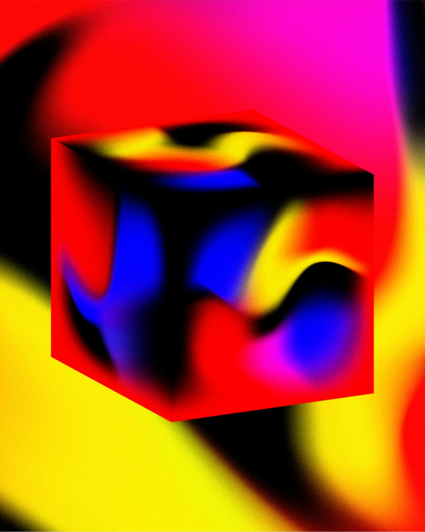
03. Neon colors that hint at a brighter future
Neon seems to be web3’s official color palette, bringing forward gradients that are vibrant and bold. This color palette choice works as a double statement: declares war on the unsaturated and monotone web of the past, and announces the boldness of what is to come.
04. 3D forms that deny the flatness of web2
To convey disruption and innovation, the ideas brought by web3 need to surpass the two-dimensionality of the web. The use of 3D creates a more tangible environment to compensate for some of the abstract concepts of web3, while enticing exploration for those who dare to wonder.
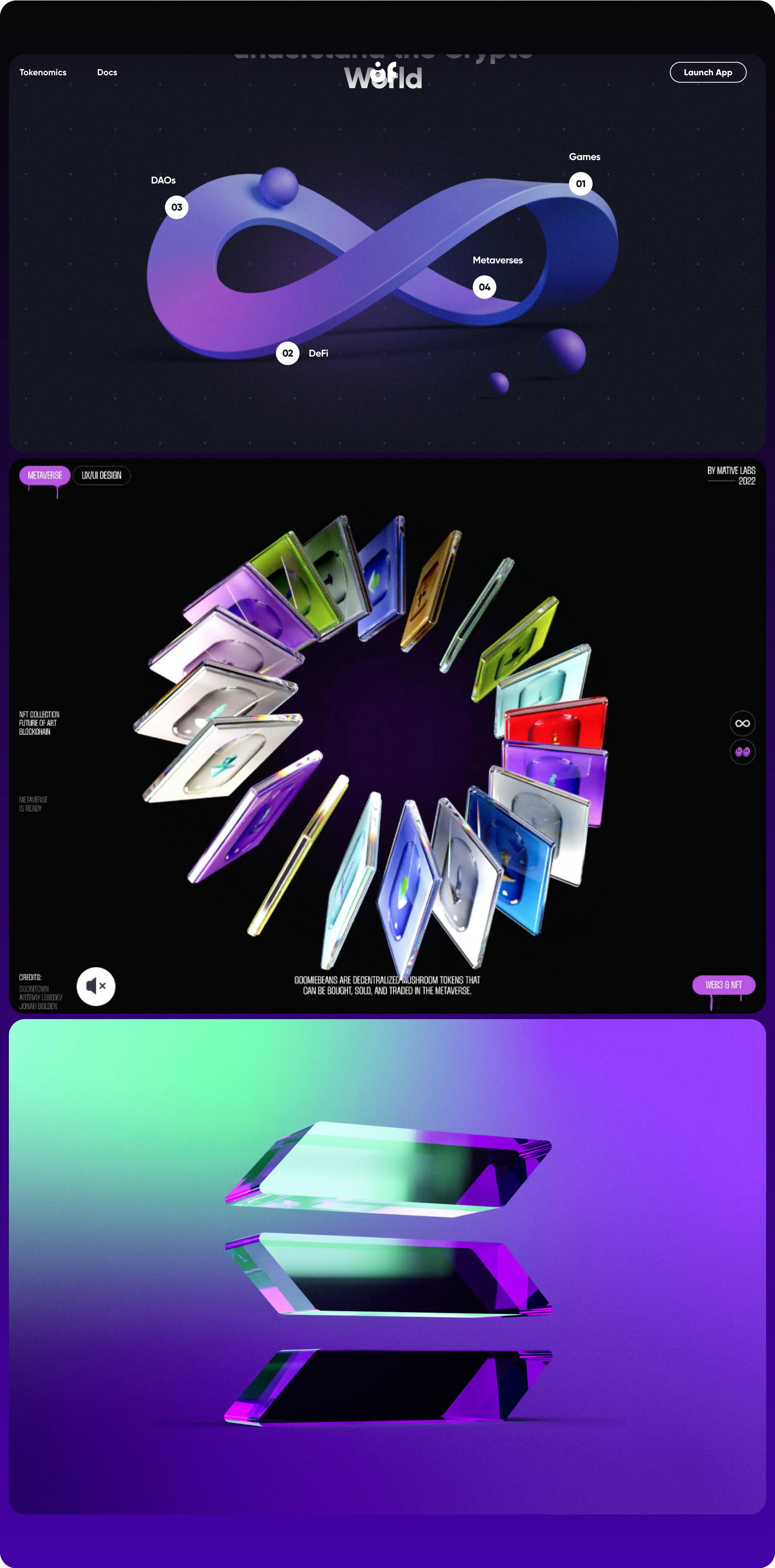
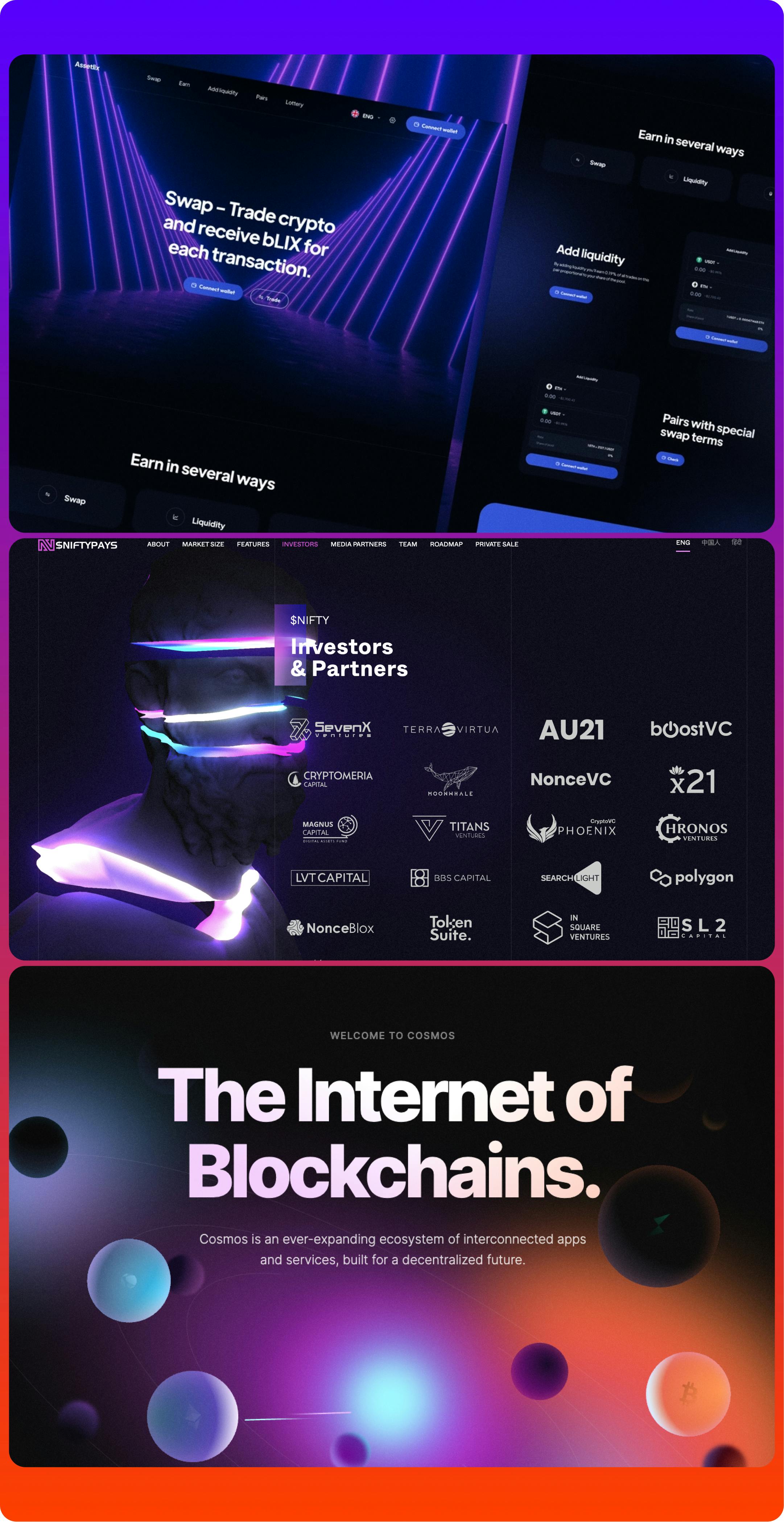
05. A futurist take on the 8-bit style
While web2 keeps trying to make technology feel more human, web3 tries to make technology more… technologic. The use of 8-bit typeface is an attempt to disrupt the neutral, sans-serif Big Tech style, while reminding us of the origins of computer displays.
06. Reign of abstract forms and anti-personalism
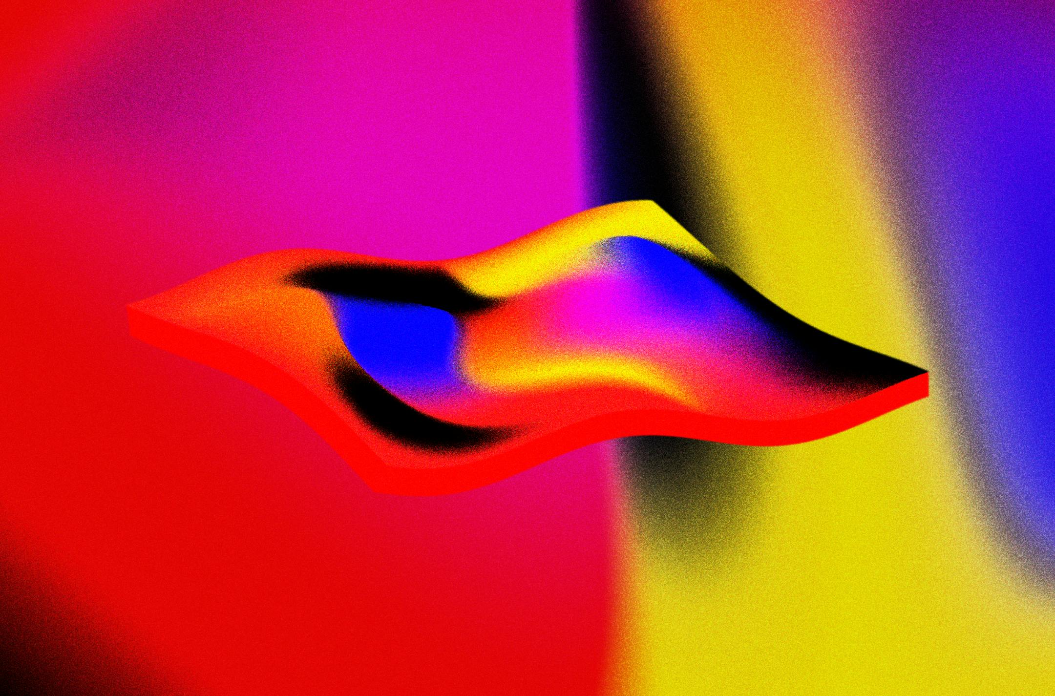
There is no place for illustration of humans with flat geometric style on this new web. Inspired by science fiction, web3 tries to shift the focus from “this is a product that fits your life” to pitching the idea of an exciting future. Instead of reminding us of the issues of our current world, abstract forms distance us from our reality and entice us to explore a new one.
While the web3 aesthetics is an emerging visual trend, it’s far from being a widespread reality beyond the design bubble. Much of it will evolve as these aesthetics make their way from niche cultures (sci-fi books, movies, video games) to mainstream businesses.
However, that doesn't mean the dystopian aesthetic of sci-fi movies is a guide to be followed.
As designers, with every new project we tend to leverage existing symbols and reinforce their meaning to be able to benefit from mental associations people will naturally make. But we also have the power to modify and repurpose those symbols, should that be our intention. From redefining the role that gender plays in our society and our designs, to understanding the unintended consequences of our actions in the world—every decision we make can have an impact.
Are we still replicating eurocentric models from 5 decades ago to define our future? What are some of the other futures we can design?

The perils of designing for scale
“We are in the midst of a major social transformation — moving many of our day-to-day activities from physical places to information-based places that we experience on our phones and computers. The central question here is: How can we design these information environments so they serve our social needs in the long term?” (Jorge Arango)
The apps we are creating are reaching thousands, millions (sometimes billions) of users, and with that, it becomes progressively harder to control all the ways in which people will interpret and use our products. In the same way the human brain wasn’t ready to build healthy relationships with communities larger than 150, our design brain alone wasn’t shaped to deal with the massive reach and impact of the experiences we’re creating — which brings along a big opportunity to rethink how we work.
The first step is to be aware of which fictions are being reinforced by our designs.
Works Cited
- 1Q84 by Haruki Murakami
- Sapiens by Yuval Harari
- The Utopia of Rules by David Graeber
- Pace Layering by Stewart Brand
- Friends Took Over the World by Rob Picheta
- Why is American currency green? By Elizabeth Nix
- CAPS LOCK by Ruben Pater
- How Science Lost the Public’s Trust by Tunku Varadarajan
- Disinformation, Democracy and Conflict Prevention by Livingston and Bennett
- Play-to-earn Gaming by Luke Winkie
- Principles of Economics by University of Minnesota
- Essay on Illustration by Rachel Hawley
- Genderless Design Is a Myth by August Tang
- The Designers Gaze by Srishti Mehrotra
- Living in Information, Responsible Design for Digital Places by Jorge Arango